Designing the Best Packaging for Your Health Supplement Products
In 2020, with the growing health-conscious audience, the entire world is acting as a potential open market for the manufacturer of dietary supplements, functional drinkers and any other food dietary with added values. Today customers can smartly distinguish between the idea of dieting and healthy lifestyle hence the demand for health supplements is in the boom.
Customers don’t love dull, boring and medicine like appearing supplements, and they want an informative yet vibrant eye catchy packaging design. According to FDA, there are certain mandatory norms to include content such as ingredients list, brand name, net quantity, dosage, name and origin of manufacturer, packer or distributor, barcode. The benefits and specifications should be mentioned on the labels.
Vitamin packaging design is an integral part of the health care industry where the foil packaging can bring in massive effects on your cost, result and customer satisfaction.
Here the foil pouch packaging will lead into three types such as flat pouch which is also known as three side seal bags, stand up pouch, spouted stand up bag for liquids and flat bottom pouch.
 Dietary products these days are sorted into color-coded categories according to their functions, Nervous System, Immune Support, Energy & Vitality, Respiratory System, Cleanse & Detoxify, System Restoration, and Optimal Well-Being. Such new formatting makes it easier for retailers to merchandise every product by category and delivers at-a-glance convenience to consumers.
While health supplements packaging design, one has to be aware of their target audience. Such as if it is for female colors should have opted, which are feminine, and overall feel of the product should be enticing and cosmetic oriented. In the case of males, pouches like sports, bold, simple, and focusing on cause and effects.
Multilingual content is preferred so that brand communication reaches to maximum audience. Warnings and statements depending on local regulations should be mention on the label. Font should be bold and clear, images on bottles, pouches or standup pouches can be ingredient oriented, or actual benefits.
SUPPLEMENT LABEL DESIGN
Whenever we see any health supplement packaging, one thing is common, the color of caps are either black or white, which is quite dull and boring. To make your product stand out, try to use a bold and vibrant color cap this should coordinate with supplement label design.
Hence the combination of the cap with a creative label design can make your dietary supplement label design memorable in a competitive marketplace. Looking at the color combination consumer will learn to associate it with your brand.
Another beautiful thing about a colorful cap is that the same size cap can often be used with bottles of different sizes.
Avoid using custom bottles or shaped supplement packaging, and it would be sufficient to use flat pouch, stand up pouch or flat bottom pouch. Protein powder packaging design and supplement box design should use attention-grabbing colors and special effects such as foil fonts or raised will help to make your label design stand out, and these can be displayed well on the above-mentioned pouches.
Here the supplement packaging design is made up of multiple layers of scientifically designed food grade, FDA approved film, will ensure vapor, odor, pests, unwanted UV light and moisture due to which the product stays intact. Durability and puncture-resistance are also important desirable features.
Be smart and updated with the latest packaging design and your choices. Try avoiding unusually shaped packaging and custom bottles, and stand up pouch and flat bottom pouch can be good choices for you.
Sometimes with line art, beautifully body structure or organs are rendered without making it look medicated products. These attributes added by using customer-friendly images beside organ images which can be fruits, plant extracts or line art images. Addition of creative yet straightforward tagline will encourage customer for the purchase. The tagline should develop trust, faith creating empathy and concern.
---------------------------
Source: Designerpeople
Blog Editor: Paul
Contact BPS Team: inquiry@bestpackagesolutions.net
Let’s make your product stand out in any where!

 Eco-Friendly Packaging Materials The Next Wave in Sustainable Design, Right at Your Fingertips!
 Interested in Elevating Your Packaging to the New Height?
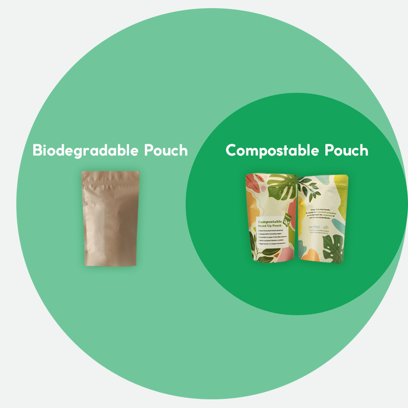
 Compostable vs Biodegradable: Which Pouch is Best for the Environment?
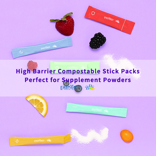
 Compostable Stick Packs for Supplement Powder