Wake Up With Better Coffee Co. Branding
When it comes to coffee packaging, bold is better. Why? Because the market is booming with thousands of different companies trying to tell you that their beans are better than the rest. The only way to prove your beans are bigger, stronger, and bolder than the rest is to say it. Better Coffee Co. demonstrates that they know what you want and need through their iconic pink and blue design. But not only is the color combination simply show-stopping, but the almost-retro font style is also ideal for this bag of beans. And this can be realized through flat bottom pouches, or side gusset pouches.
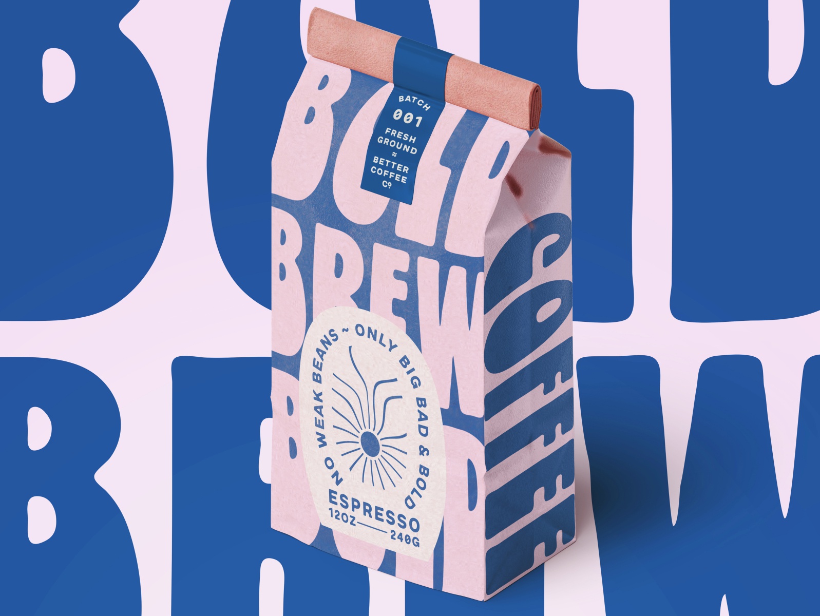 Better Coffee Co. roasters launched with a mission to bring the world only the strongest, boldest and most flavor-packed brew daily. ‘No weak beans here.’ Responsible for the branding and packaging design for the client, I originally took them in many different directions stylistically — to land at this groovy take. Approachable but premium was an important brand pillar, along with trust in quality and fresh, and I believed these were what distinctive coffee packaging called for. I imagined it sitting on a store shelf and hoped that the bold color palette and use of oversized type would be enough to wake one up.
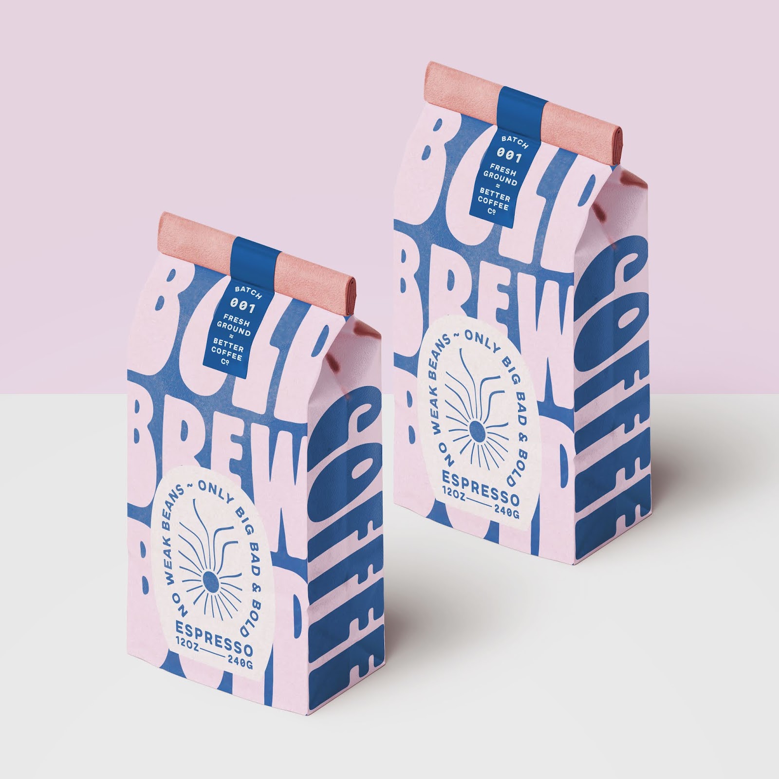 Better Coffee comes with side gusset pouches, which can stand well on the shelf and show the branding to the consumers. The shipper box designed with consistency image, which is a good examples for coffee brand.
For Better coffee designs, BPS have a 100% SUSTAINABLE pouch solution to better the branding. Currently, they’re able to provide high barrier compostable coffee pouch for the coffee brand, zipper and valve are also compostable.
---------------------------
Source: Dieline-Chloe Gordon
Blog Editor: Paul
Contact BPS Team: inquiry@bestpackagesolutions.net
Let’s make your product stand out in any where!


 Eco-Friendly Packaging Materials The Next Wave in Sustainable Design, Right at Your Fingertips!
 Interested in Elevating Your Packaging to the New Height?
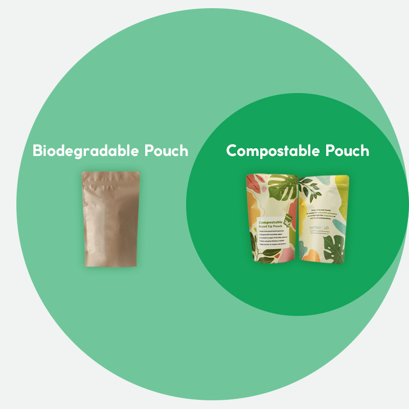 Compostable vs Biodegradable: Which Pouch is Best for the Environment?
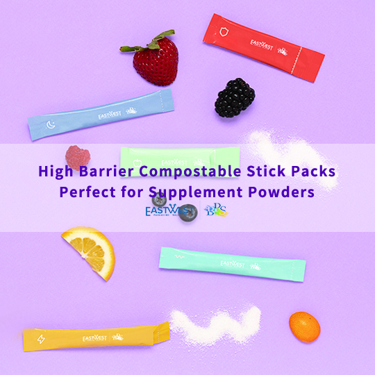 Compostable Stick Packs for Supplement Powder