Designing the Standouts Snack Bar Packaging
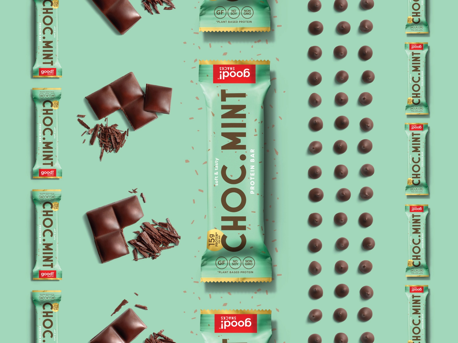
Americans love snacks. According to a recent Mintel report, 95 percent of U.S. adults snack daily, and 70 percent snack more than twice per day. This eating habit grew the snack bar category alone 20 percent from 2012 to 2017, with growth expected to continue by an additional 4.4 percent by 2023. So how are CPG brands selling snack bars supposed to stand out in this competitive, crowded space? Beyond having a great product and designing the perfect food packagaing bags — one that resonates with their target market and helps set a snack bar brand apart — here are six ways to make a statement in the snack aisle.

Transparency
Consumers in 2019 want to know what’s in their snacks and tend to lean toward brands that put all their cards on the table. They want to see what they’re buying too, making clear packaging design such as transparent stand up pouch a plus. KIND bars put their product on full display.
Takeaway: Consumers want to know what they’re putting in their bodies. Let them know you have nothing to hide.
Storytelling
Packaging design is an opportunity to concisely tell a brand story to potential customers. Touting a lifestyle, cause or mission that consumers can connect with can go a long way. CLIF Bar's outdoor, adventure-focused illustration reflects their brand and serves as a call-out for likeminded consumers looking for a snack that meets their energy needs.
Takeaway: A well-crafted story through prominent visuals or copy can provide that extra inspiration that will provoke a purchase.
Minimalist, Clean Design
More consumers than ever actively seek-out healthier snack bar options made of simple, real ingredients. The packaging design should reflect that clean, minimalist lifestyle. RXBAR uses a clean color palette and highlights ingredients clearly by putting them front and center and underlining each one.
Takeaway: Simple paper pouch can help establish authenticity.
Design Needs to Reinforce Price Point
If brands expect consumers to purchase at a premium price point, the packaging design should reflect the perceived value of the product. As a matter of comparison, Kashi bars cost $20 for a box of 12, while conventional Chewy granola bars are just $4 for a box of 18. The clean, white design and matte texture of Kashi’s food packaging bags showcases its superior value against Chewy’s bright, cluttered, package.
Takeaway: The quality of your packaging should meet or exceed the quality of your product.
Prioritize Branding
Some products’ greatest appeal is they have “homemade” roots. As such, packaging can sometimes be an afterthought, or give off a DIY impression. Strategic design can help deliver a nice balance for fast-growing brands that have a homegrown image to preserve. LÄRABAR began in its founder’s kitchen, then grew exponentially. The basic, clean lines of packaging, paired with eye-catching colors evoke a natural feel with a modern twist.
Takeaway: Even if resources are limited, positioning, story and packaging design should be a top priority.
Stand Out
The regal design of EPIC’s stand up pouch pulls its weight, reflecting a superior, distinct product. The realistic Audubon-esque illustration is a nice stylized packaging design approach without being overwhelming.
Takeaway: Don’t just conform to what other brands are doing. Find your own identity and own it.
---------------------------
Source: Gykantler
Blog Editor: Paul
Contact BPS Team: inquiry@bestpackagesolutions.net
Let’s make your product stand out in any where!

 Eco-Friendly Packaging Materials The Next Wave in Sustainable Design, Right at Your Fingertips!
 Interested in Elevating Your Packaging to the New Height?
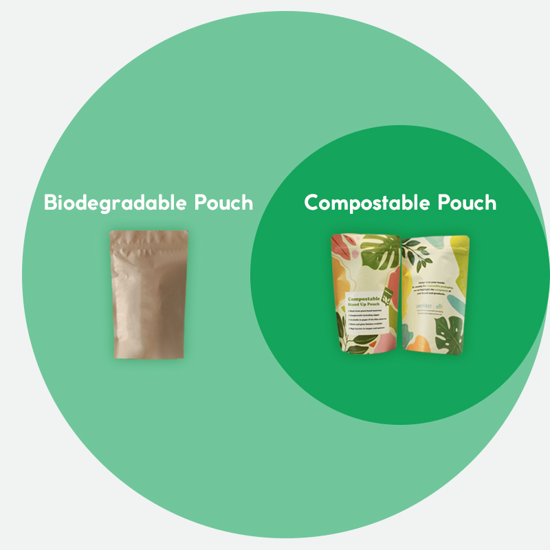
 Compostable vs Biodegradable: Which Pouch is Best for the Environment?
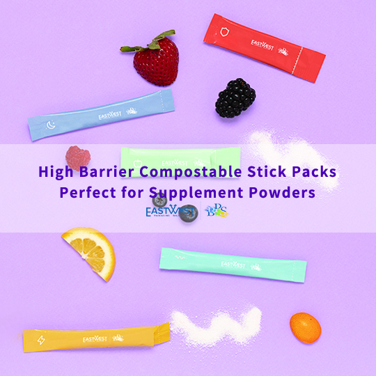
 Compostable Stick Packs for Supplement Powder